Social Media
This week, Pantone announced that it had chosen two colors of the year for 202
December 23rd, 2020 | by: Steve Pollack | Posted in : Marketing, Digital Trends
This week, Pantone announced that it had chosen two colors of the year for 2021: Ultimate Gray and Illuminating, a combination of dull, familiar gray and the bright yellow of lemon skin. It’s a choice for the past year of quarantine, a time in which we had to insulate ourselves from the world and curl up in monochrome blankets at home: “It’s a dependable gray,” as Leatrice Eiseman, the executive director of the Pantone Color Institute.
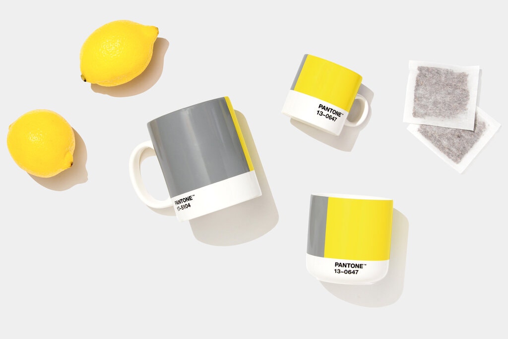
The gray of cloudy skies, sidewalk cement, comfortable bed linens, gravity blankets, or low-light screens—the color evokes our collective experiences over the past year. It’s a depressing summation: During nine months of quarantine, we’ve certainly arrived at the “ultimate gray,” a state of mind—mush—as much as the color of a product. Grayness means ambiguity and irresolution. Neither black nor white, it doesn’t point toward an ending, just the continuation of an indefinite period. With coronavirus cases still mounting in the United States, that’s certainly where we’re at.
Though the color of the year is meant as a trend forecast, an evidence-based finding on which hues are newly popular, the 2021 picks seem clearly metaphorical, more of a marketing message than a trend. “Illuminated,” the bright, highlighter-yellow color, is the light at the end of the tunnel, the sun rising over a dark landscape, the dawning of hope that comes with the possibility of a vaccine.
Together, the combination looks a lot like Maurizio Cattelan’s viral sculpture of a banana stuck on the wall with duct tape. The pairing of yellow and gray is a little bit slapstick: a rubber ducky in a jail cell. The total contrast between the two is absurd, the commercial slickness of the yellow confronting implacable, average gray.
Over the past decade, Pantone’s color picks have been remarkably saturated, with bright, striking hues like Living Coral (2019), Ultraviolet (2018), and Radiant Orchid (2014). These are energetic colors, the kind that can spark inspiration or surprise. Gray isn’t nearly as exciting, but how could the company announce anything else after the past year except that omnipresent, boring shade? More than anything else, we’re looking for a return to normalcy.